Overall I enjoyed building this 3D environment, especially the planning before hand and being able to choose which environment I could build. Time management was very well done as I spent right correct amount of time on each section of the project, for example I spent at least an half an hour on each of the object/assets in my environment. I also feel that I have really captured the idea of the Roman environment through my designs and illustrations.
My research was well presented and structured, as it shows my process of analysing all the other types of environments, choosing which environment and then explaining what decisions led me to choose the walled city. In m research I identified than all the other environments reminded me of other games I have played with similar maps, aesthetic and atmosphere. The descriptions of the environments also fit the games style of art, for example, walled city reminded me of SMITE as its based off of roman structures and buildings in the roman empire. Another example is the Victorian environment which really resembles the world of Dishonoured with cavalry, sword armed soldiers with Victorian guns.
As for improvements, the collective recording of my building and designing could have been implemented much better and clearer as I was making my environment. More info could have been shown as to how i actually shaped the objects and combined them in order to create the final objects. Despite this, I have explained the processes well and shown them threw images and illustrations.
Unit 68 - 3D Environments
Tuesday, 20 June 2017
Monday, 19 June 2017
Environment Build
In this screen shot I am building the bigger house you can see on the left of the front of the map. I used a Cube to design this house and the extrusion comand.
This screen shot is of a public chair, I aslo used a cube to design this seat using the extrusion command and scaling tool. The picture on the right is an enlarged version of the same model chair, this seat would be used to seat more than just 2 people at a time, and can be seen behind the bigger house on the left of the front of the map.
Here are 2 screen shots of the tree design. On the left is the actual tree model created from a cylinder using extrusion, stretching and scaling of the vertices and faces of the shape. On the left is a set of tree duplicates placed in line resemble a row of finely cut trees set around all of the buildings and the walls.
The second set of buildings I created were these two small houses. Built from a cube model, I used the same techniques to transform the cube into a house model. Such techniques as extrusion, subdevision and scaling.
Here is a screenshot of the Last buidling I created and its contents. On the left you can see the entire temple, invluding the small ranp walk way and all the supportice pillars. I created the pillars seperetly and then attached them onti the roof and the floor of the temple. Within the temple is a chalice/gobblet of fire the illuminates the map with a bright light. I created the chalice and pillars from cylinders using extrusion and subdevision on both. I then duplicated the pillars and placed them underneath the roof and on top of the ramp walk way.
Here is a screen shot of both the outer and inner walls of the map. The wall on the right is the outer wall and the wall on the left is the inner wall. These were aslo created using a cube and then extruded to long lenghs to made resemble a miniture wall and a big seperation wall.
Showcase/talk through - Environment
My first Screen shot is of a top view of my map and the corner of the entrance at the front of the walled town. From this angle and hitgh you can see the entire and all of its buildings.
This is a more higher view/side view of the town with the light casting it in shadows highlighting the rest of the map. From here you can see a clear view of the bigger house out of the three on the right side of the environment.
Here is a view from the back of the map showing the chalice within the temple glowing and spreading light threw thr temple pillars and trees.
In these screenshots you can see a clear view of the inside of the temple with the chalice. The mini temples would usually have smaller chalices within them, but for lighting effect i decided to only add one in the biggest temple. The front entrance path through the city toweards the bigger temple splits into 2 path ways that take you around the temple to the back side that you saw before.
As you come back around the big temple you can return to the middle path and the town to observe the fron thouses sourrounded by trees and a set of seats.
Wednesday, 17 May 2017
Task 2D
FutureSkills@MediaCityUK
Centre
BTEC
Level 3
Extended Diploma in Creative
Media Production
Games
Design
|
 |
Units 68 & 67 – 3D
Environments and Animation
Legal and Ethical Checklist
This DECLARATION,
made by the undersigned:
Roberto D'alberto
|
Hereafter
referred to as the “Creator” is made
this 22nd day of May in the year Two Thousand and Seventeen.
Roberto has checked and
agreed that the “Work” has been
checked for decency, representation of race, gender religion and sexuality and
has met an appropriate standard. I take full responsibility for the work
produced, recognising that the copyright resides with White Paper Games and
that I release said company of any responsibility regarding the altering or
unauthorised use of supplied materials in the making of the Work.
AGREED TO AND
ACCEPTED.
Signature:
|
Roberto D'alberto
|
Printed
name:
|
Roberto D'alberto
|
Date:
|
22/05/17
|
Wednesday, 10 May 2017
Monday, 8 May 2017
Task 2 B
Why did I choose the roman theme?
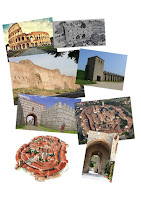
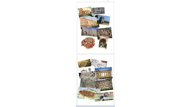
 There are 4 environments we can choose from, Walled City, Forest, Space Settlement and Urban streets. Being my favourite type of aesthetic, I chose the Roman walled City because it reminds me of a game called SMITE, that also has very similar architecture and decorative style. In order to fully understand how I would design each of the themes, I pared each theme to a game with similar technology, environment and architecture. Below is the names of the Themes and next to them is the name of the associated game. The game smite also has Roman Gods as playable characters that also influence me to pic this theme as mine.
Walled City/Smite
 The Walled city theme has brick structures and pillars that of the age of the Roman Empire, including Colosseums and Roman castles. This theme would most likely be designed using rocky, old and rough textures with iconic Roman assets. In entirety this theme has to describe and be the embodiment of the Romans during the roman Empire. Smite also has Roman culture and architecture in its maps and mythology about gods, as the game is based on a war between ancient mythical Gods. For this reason I chose the map Conquest, which is based in Greece, which is very similar to Roman architecture.
Space Settlement/Alien
Urban Streets
 Set in the times of royalty, known as the Victorian times, back when Jack the ripper was a big headline that poured fear into the hearts of he citizens of England. Horse carriages, rats and thieving children always common around every corner of a street or road. Sherlock Holmes, known as the smartest detective in the country, is set on another case...
Wednesday, 19 April 2017
Subscribe to:
Comments (Atom)


